25 Fall Wedding Color Palettes Trending for 2026
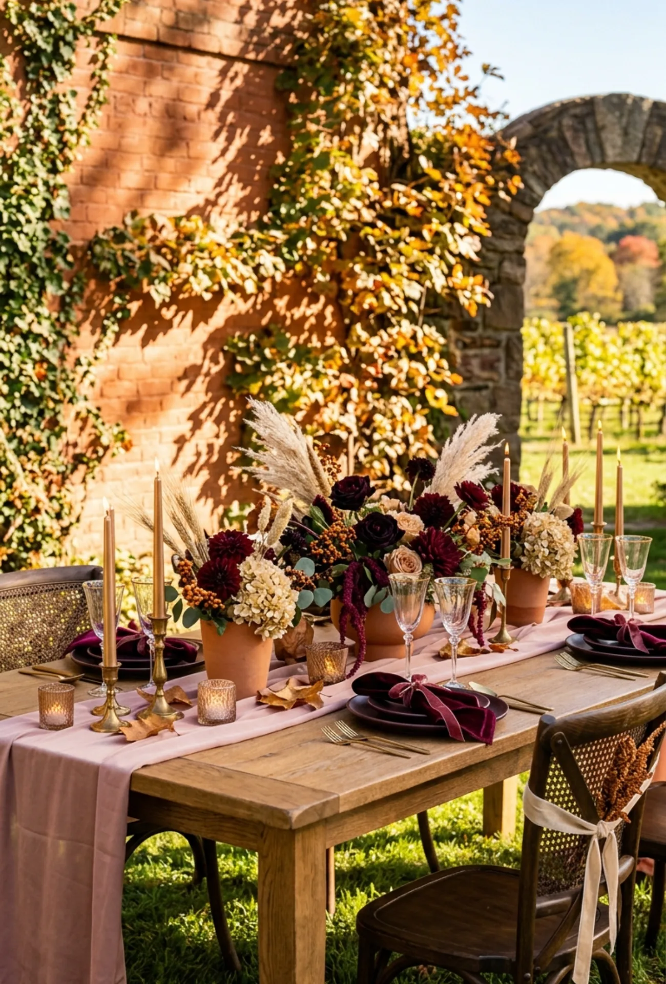
Fall weddings have a magic that no other season can match. The golden light, crisp air, and rich surroundings make everything feel more intimate and beautiful.
Color sets the mood before a single vow is spoken. The right palette can turn any venue into something guests will talk about long after the night ends.
These 25 fall wedding color palettes for 2026 are genuinely stunning combinations that real couples are loving right now. Let them inspire you to find the one that feels completely, beautifully yours.
1. Black Cherry and Champagne Elegance
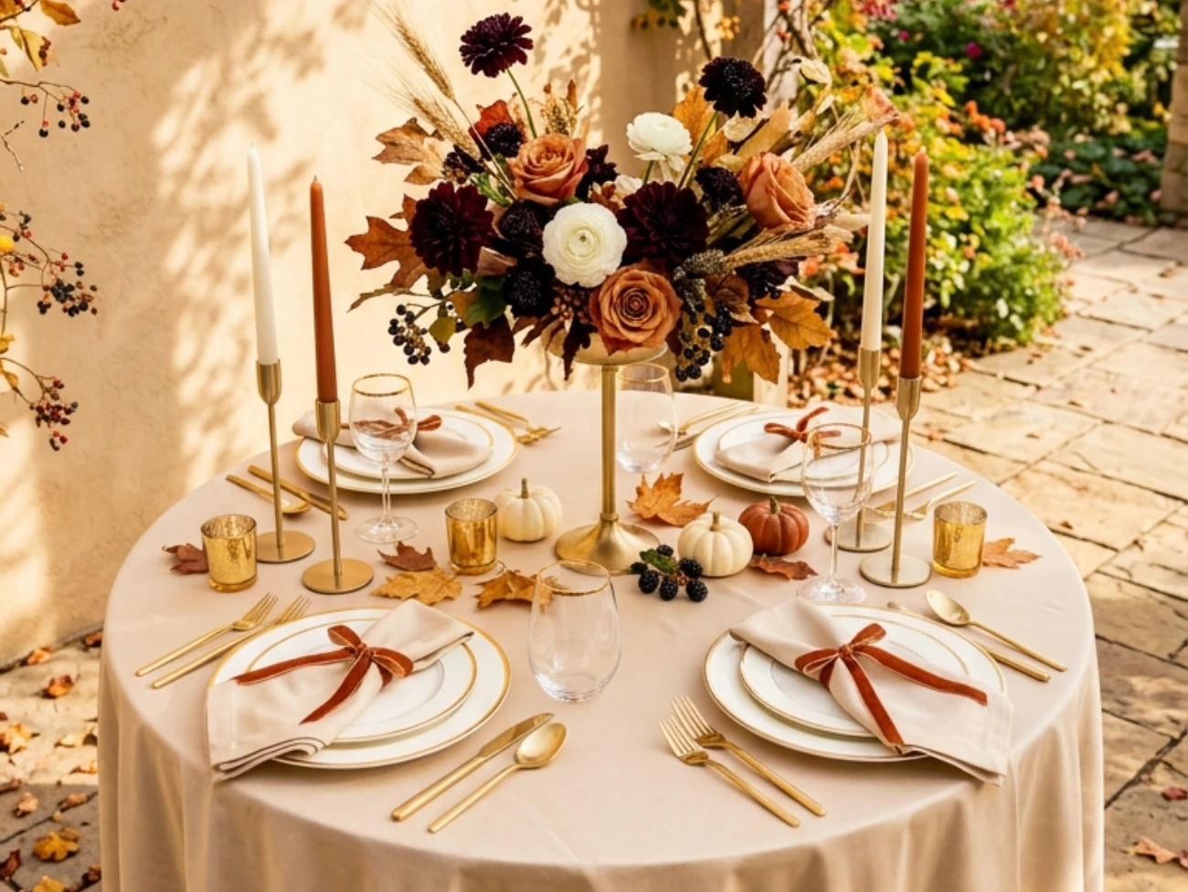
Black cherry brings deep, wine-soaked drama while champagne keeps everything feeling warm and refined. Together they create a palette that feels luxurious without ever looking overdone.
Think velvet ribbons, berry-toned blooms, and soft metallic candlelight flickering through an evening reception. It is the kind of color story that photographs like a dream.
Hey there! Some links on this page may be affiliate links which means that, if you choose to make a purchase, I may earn a small commission at no extra cost to you.
2. Cinnamon, Olive Green, and Ivory
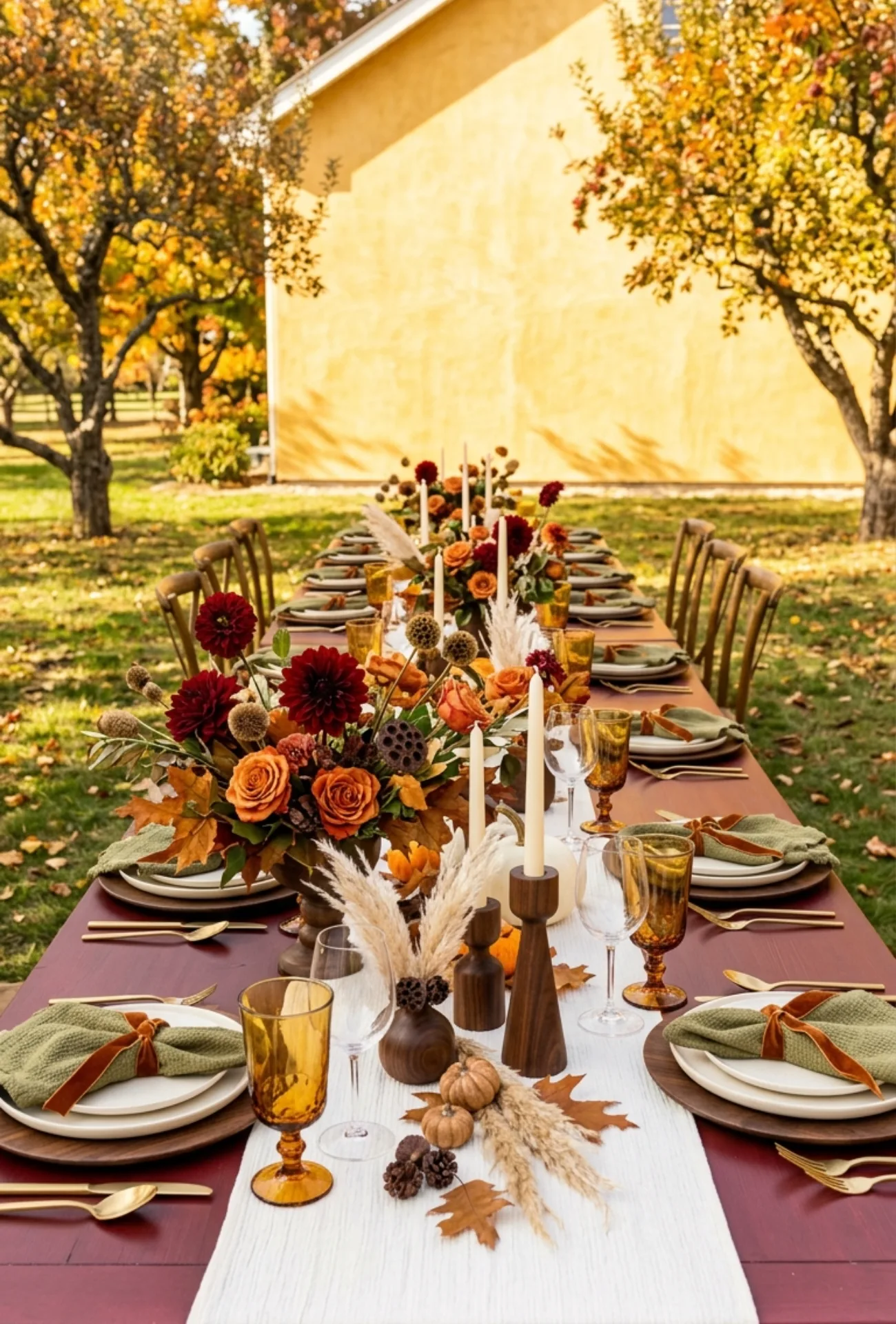
This trio feels like fall in the most honest and beautiful way possible. Cinnamon adds spice, olive green brings an earthy grounded feel, and ivory ties it all together softly.
It works perfectly for outdoor ceremonies surrounded by autumn foliage or rustic barn settings with warm wood tones.
3. Espresso Brown with Warm Beige
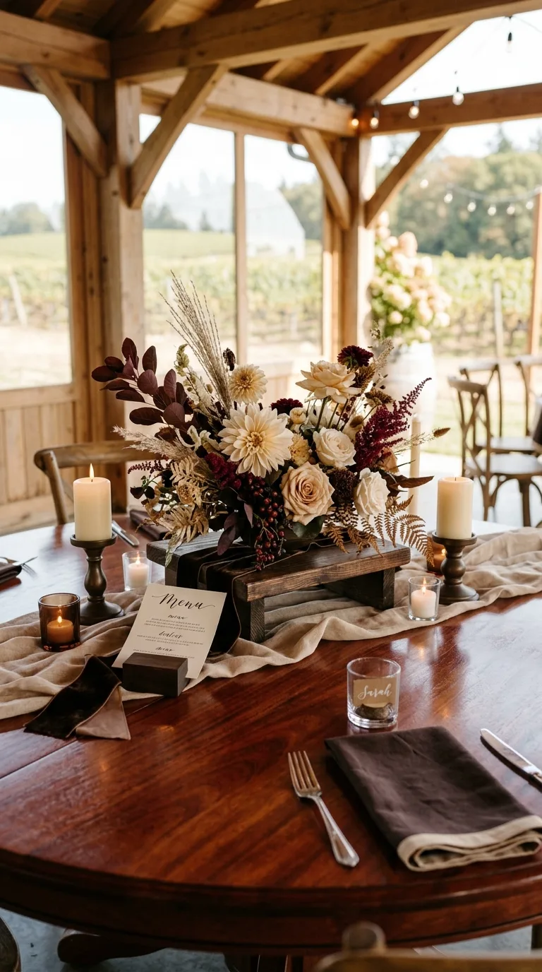
Espresso and warm beige is one of those combinations that feels deeply cozy and endlessly elegant at the same time. It is understated but never boring.
Use espresso in linens, ribbon details, or wooden accents, and let beige florals and candles do the softening work around them.
4. Terracotta and Soft Sand Neutrals
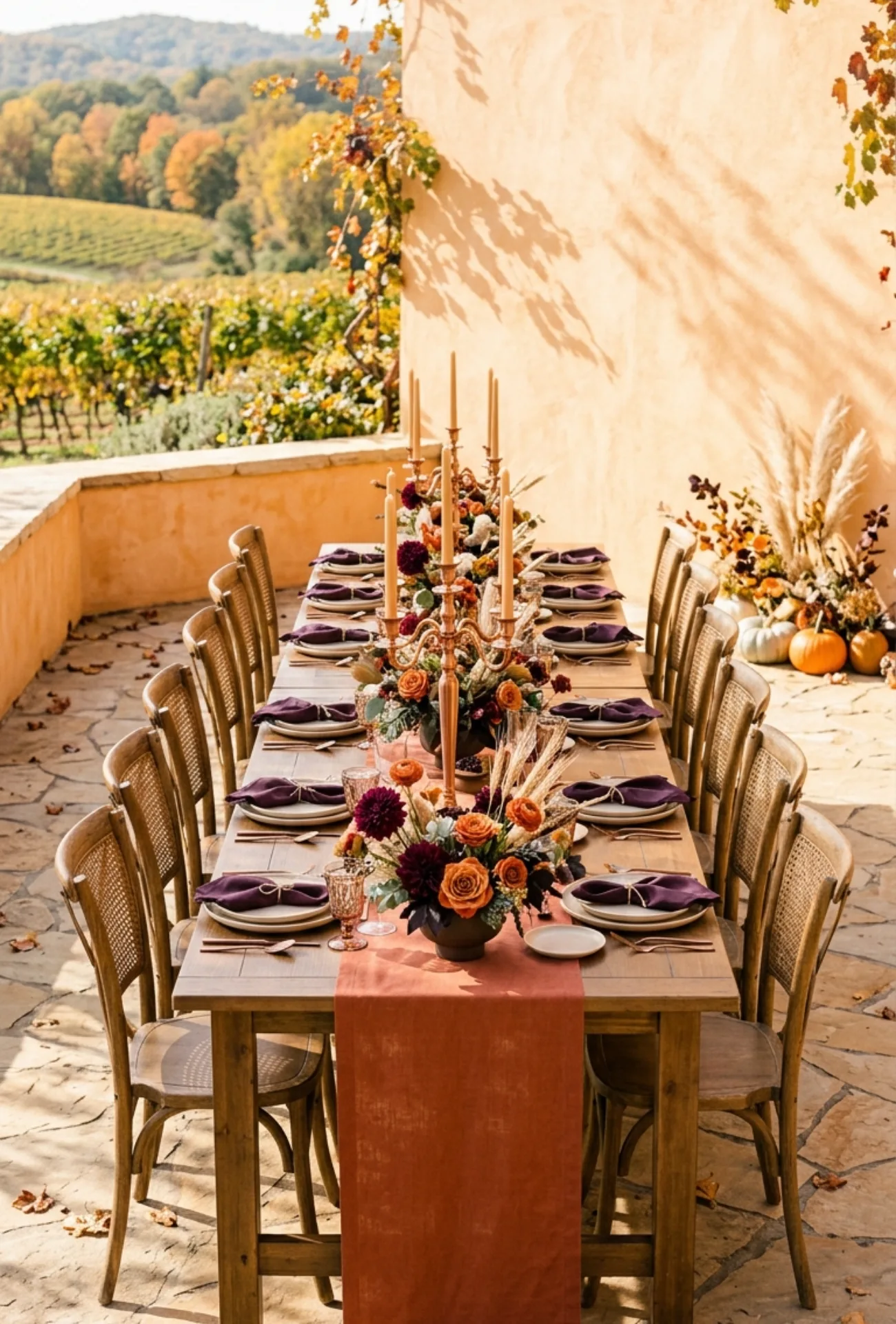
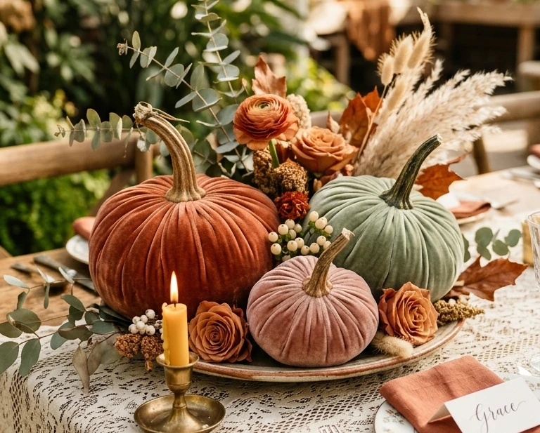
Terracotta has been a wedding favorite for a few years now and it is not going anywhere in 2026. Paired with soft sand neutrals, it feels grounded, sun-warmed, and genuinely beautiful.
This palette is stunning in outdoor venues, desert settings, or anywhere with natural textures like linen, rattan, or dried grasses.
5. Aubergine with Dusty Blush Accents
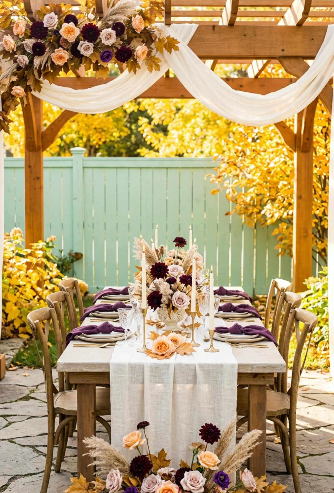
Aubergine is bold and moody in the best possible way. Add dusty blush and it immediately softens into something romantic and unexpectedly feminine.
This pairing works beautifully in floral arrangements where deep purple blooms sit alongside soft blush roses and dried pampas grass.
6. Forest Green and Antique Bronze
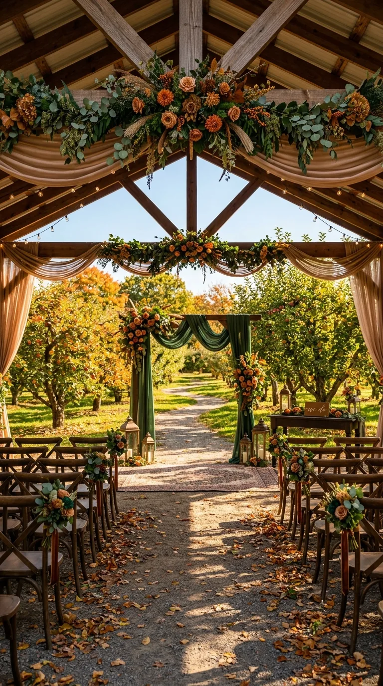
Forest green feels lush and rich and completely in its element during fall. Paired with antique bronze, it takes on a vintage warmth that feels both timeless and deeply seasonal.
Use this palette for tablescapes with bronze candlestick holders, greenery garlands, and deep foliage centerpieces that feel pulled straight from the forest floor.
7. Caramel and Dusty Blue Romance
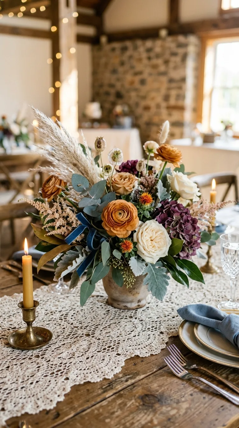
Caramel and dusty blue is one of those unexpected combinations that just works. The warmth of caramel softens the coolness of dusty blue into something gentle and genuinely romantic.
It is a great palette for couples who want fall warmth without leaning into the typical orange and red tones of the season.
8. Rust Orange with French Blue
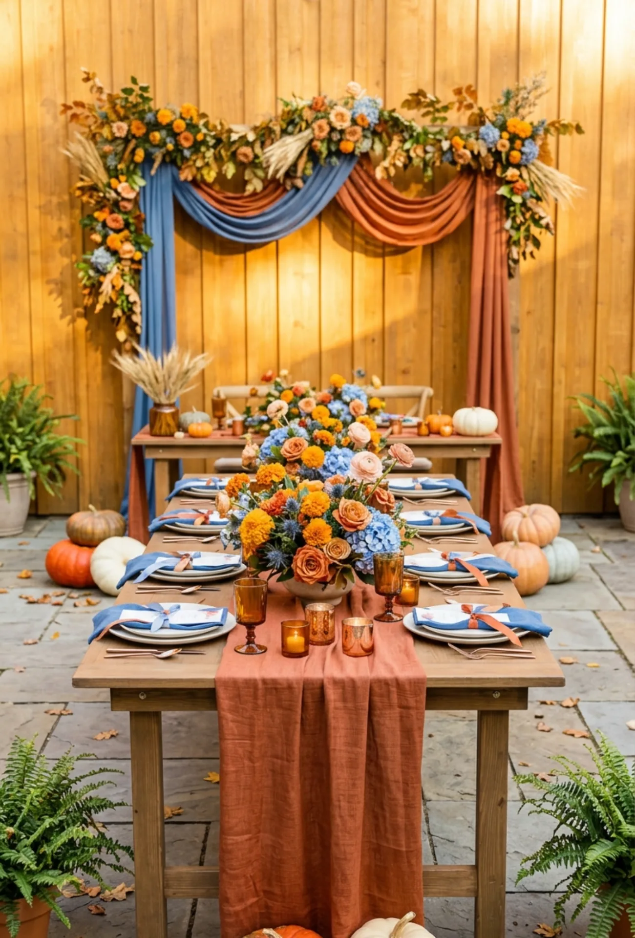
Rust orange is bold, seasonal, and full of personality. French blue brings in a sophisticated coolness that keeps the rust from feeling too intense or expected.
| Element | Rust Orange | French Blue |
| Florals | Marigolds, dahlias | Hydrangeas, thistles |
| Linens | Table runners | Napkins, draping |
| Accents | Candles, pumpkins | Ribbons, stationery |
This contrast makes for incredibly striking wedding photos, especially in outdoor venues with natural light.
9. Merlot Red and Soft Taupe
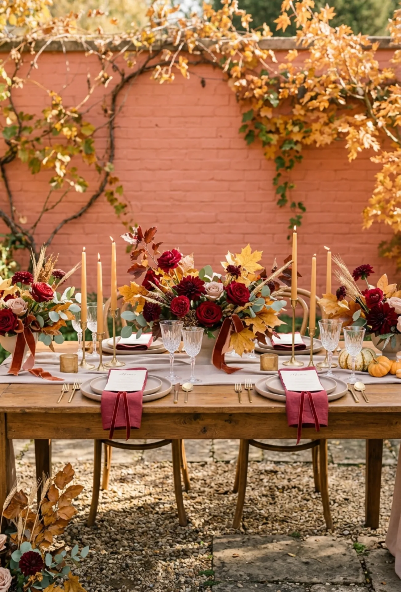
Merlot red feels grown-up, romantic, and deeply fall without leaning too festive or Christmassy. Soft taupe keeps it mature and grounded rather than flashy.
Together they create a palette that feels like a candlelit dinner for two, extended across an entire beautiful wedding day.
10. Burnt Sienna and Cream Whites
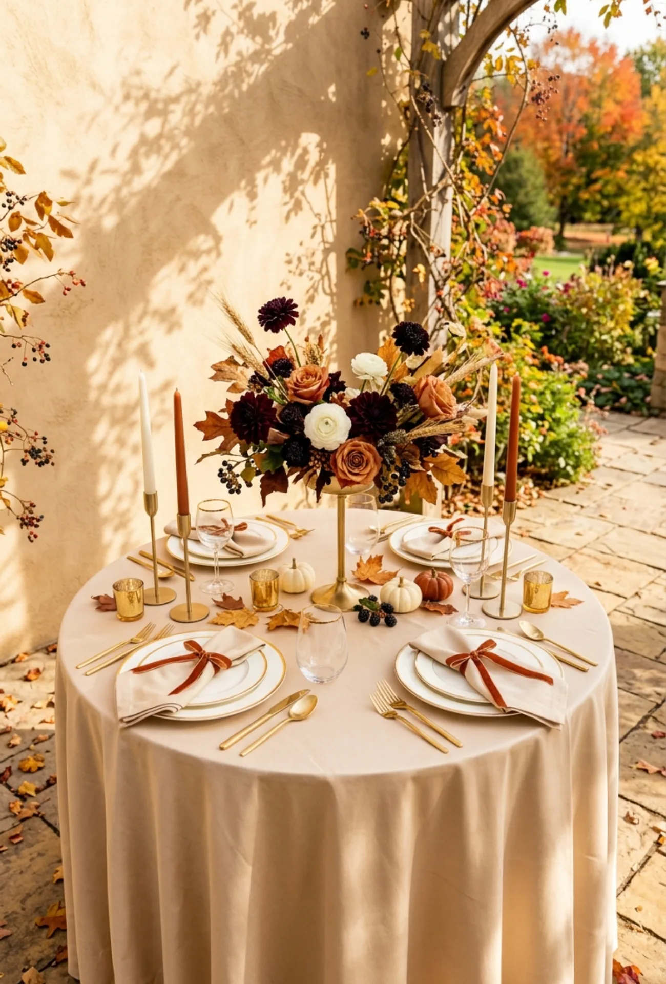
Burnt sienna is that perfect in-between shade, warmer than orange and richer than tan. Paired with clean cream whites, it feels fresh, natural, and genuinely gorgeous.
This is a palette that photographs especially well in golden hour light. The warm tones glow in a way that feels almost unreal.
11. Olive Green and Butter Yellow
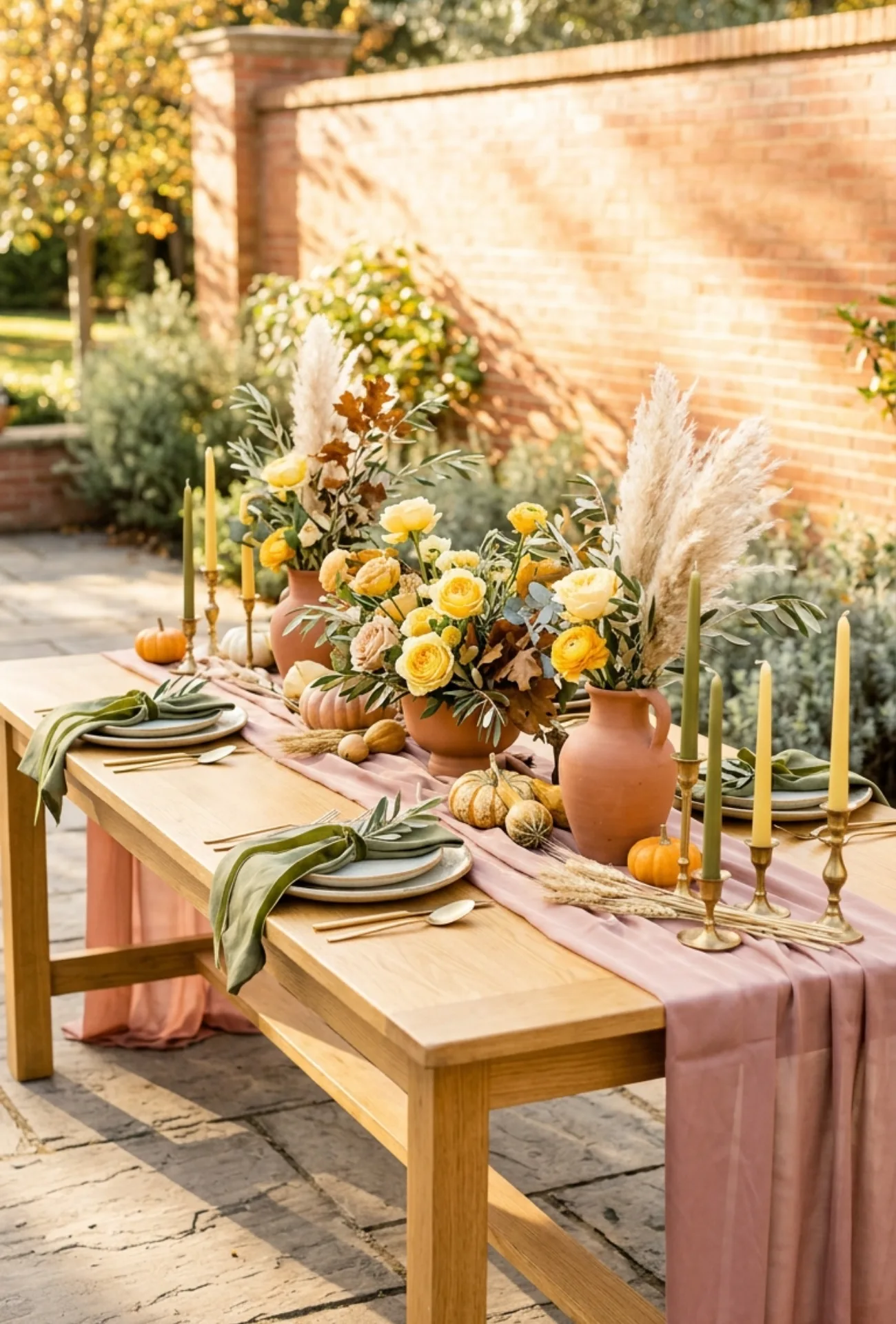
Olive green and butter yellow together feel sunny, soft, and quietly joyful. It is not a loud palette but it has a warmth that fills a room beautifully.
Use butter yellow in florals like garden roses or ranunculus, and let olive green do the grounding work in foliage, ribbons, and linen details.
12. Copper, Moss Green, and Ivory
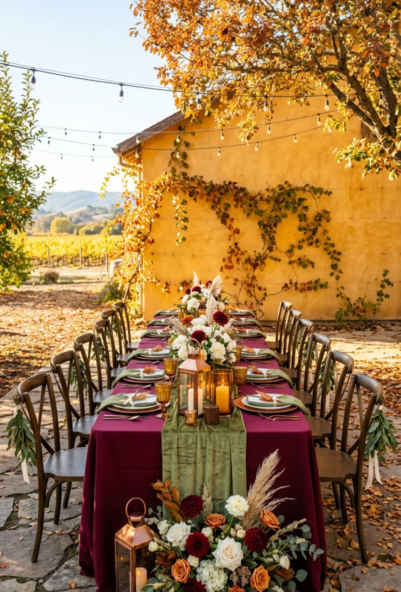
Copper brings a metallic warmth that feels completely at home in fall. Add moss green and ivory and you have a palette that feels both earthy and elevated.
- Copper lanterns and votives along the aisle
- Moss green foliage woven through ceremony arches
- Ivory florals in centerpieces and bouquets
- Copper flatware and charger plates at reception tables
Every detail in this palette feels intentional and beautifully cohesive when layered together.
13. Chocolate Brown with Sage Green
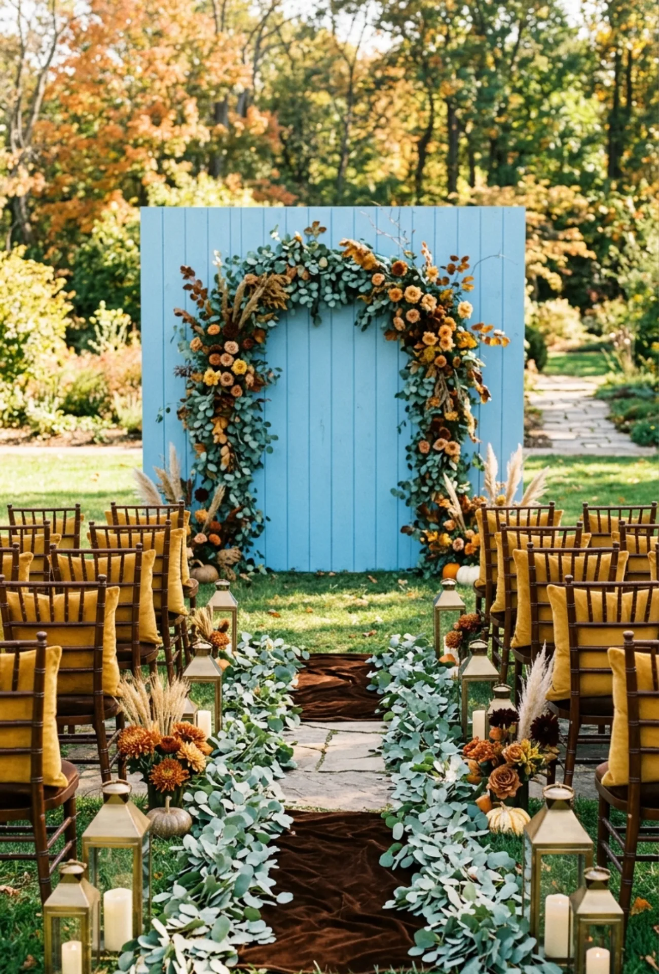
Chocolate brown is rich and grounding and brings a sense of warmth that works so naturally in fall settings. Sage green adds a softness that stops it from ever feeling too heavy or dark.
This palette suits venues with natural wood, stone, or exposed brick where the earthy tones can really breathe and settle.
14. Plum Purple and Antique Gold
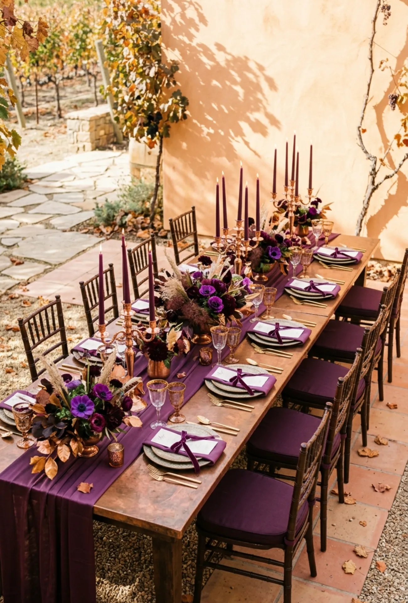
Plum purple has a quiet drama that feels very fitting for fall ceremonies. Antique gold gives it a warmth and vintage character that feels genuinely romantic and special.
Use antique gold in candle holders, frames, and stationery details while plum florals like anemones and dahlias take center stage in arrangements.
15. Deep Teal with Warm Camel
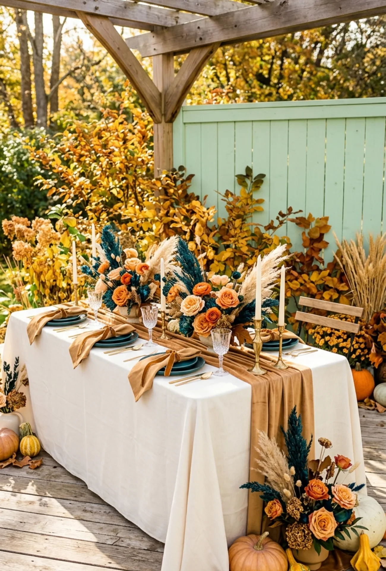
Deep teal is a bold and unexpected fall choice that pays off beautifully when styled well. Warm camel softens it and brings in that cozy autumnal feeling the season is known for.
| Venue Type | Why It Works |
| Garden or outdoor | Teal echoes nature, camel reflects earthy warmth |
| Ballroom or indoor | Teal adds drama, camel keeps it inviting |
| Rustic barn | Camel dominates softly, teal pops in florals |
This combination has a quiet confidence that makes weddings feel styled rather than decorated.
16. Mulberry and Natural Stone Tones
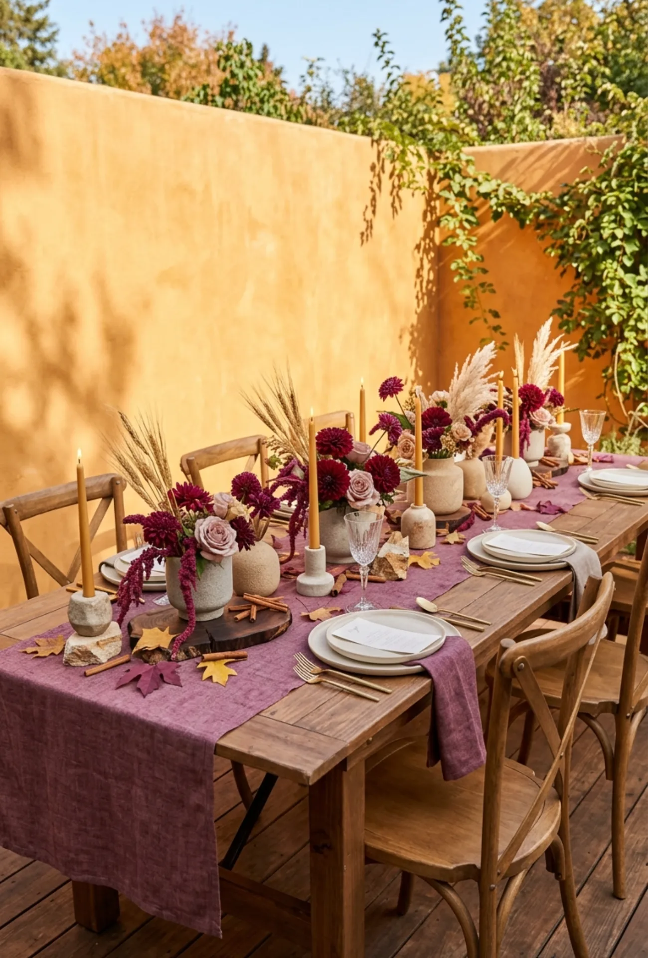
Mulberry sits somewhere between plum and burgundy, and it is one of the most underused shades in fall weddings. Natural stone tones like warm gray, sand, and dusty white give it balance and elegance.
This palette feels especially beautiful in venue spaces with exposed stone walls, candlelight, or architectural details that add texture to the overall look.
17. Burgundy with Soft Peach Florals
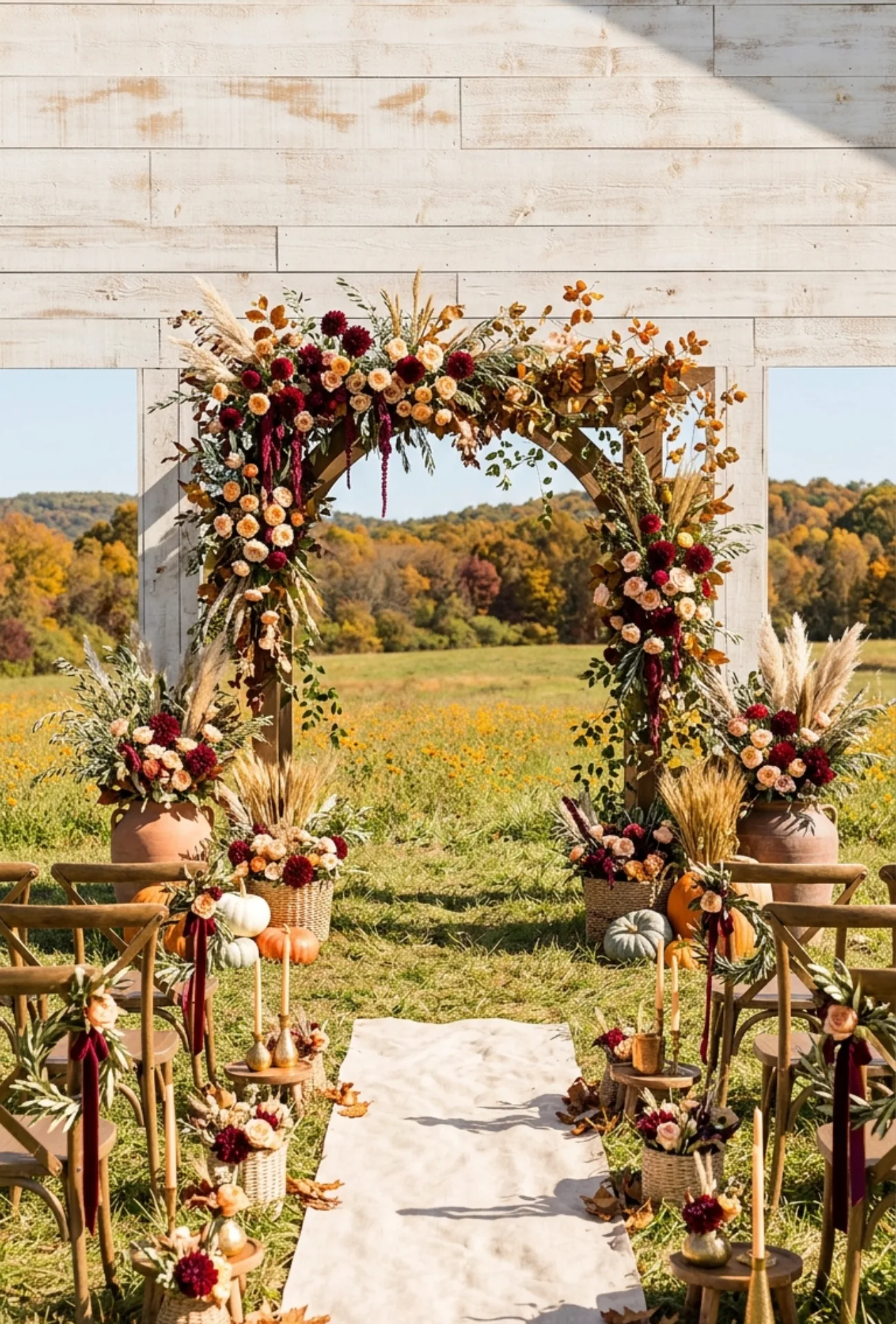
Burgundy is a fall classic for good reason. It is rich, romantic, and endlessly versatile. Soft peach florals bring in a gentleness that keeps the palette from feeling too heavy or traditional.
The contrast between deep burgundy and soft peach creates a natural visual interest in bouquets, centerpieces, and table styling that feels both fresh and timeless.
18. Ochre Yellow and Charcoal Gray
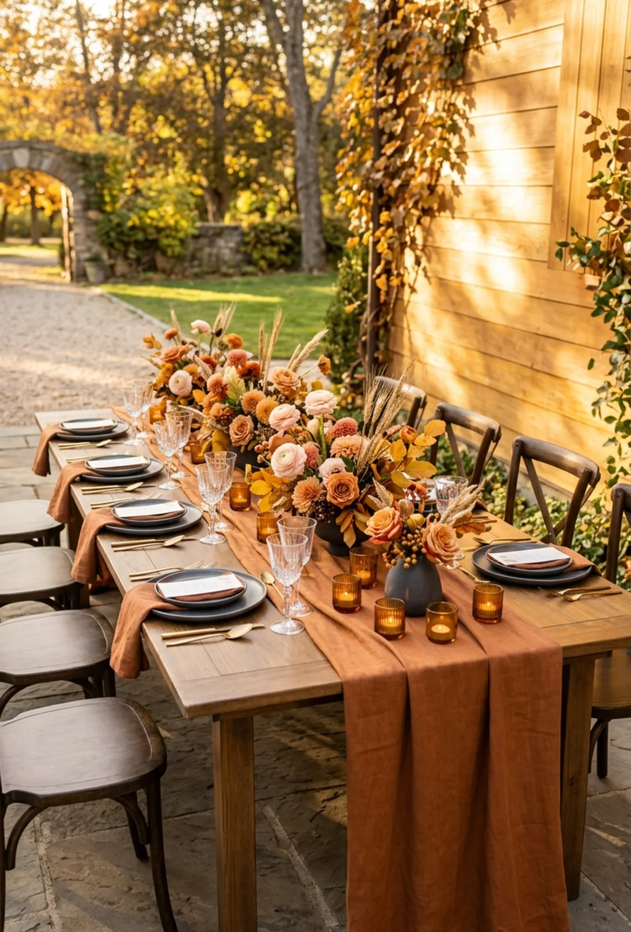
Ochre yellow is bold and earthy and unlike any other yellow. Paired with charcoal gray, it becomes something unexpectedly modern and strikingly beautiful for a fall wedding.
This is a great palette for couples who want to feel a little different from the crowd without straying too far from seasonal warmth.
19. Wine Red with Pearl White
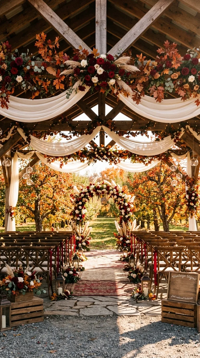
Wine red and pearl white is one of those classic pairings that never actually gets old. The depth of wine red against the soft luminosity of pearl white creates instant elegance.
Use pearl white in table linens, drapery, and florals, and let wine red come through in blooms, ribbon details, and stationery for a result that feels polished and intentional.
20. Emerald Green and Cinnamon Brown
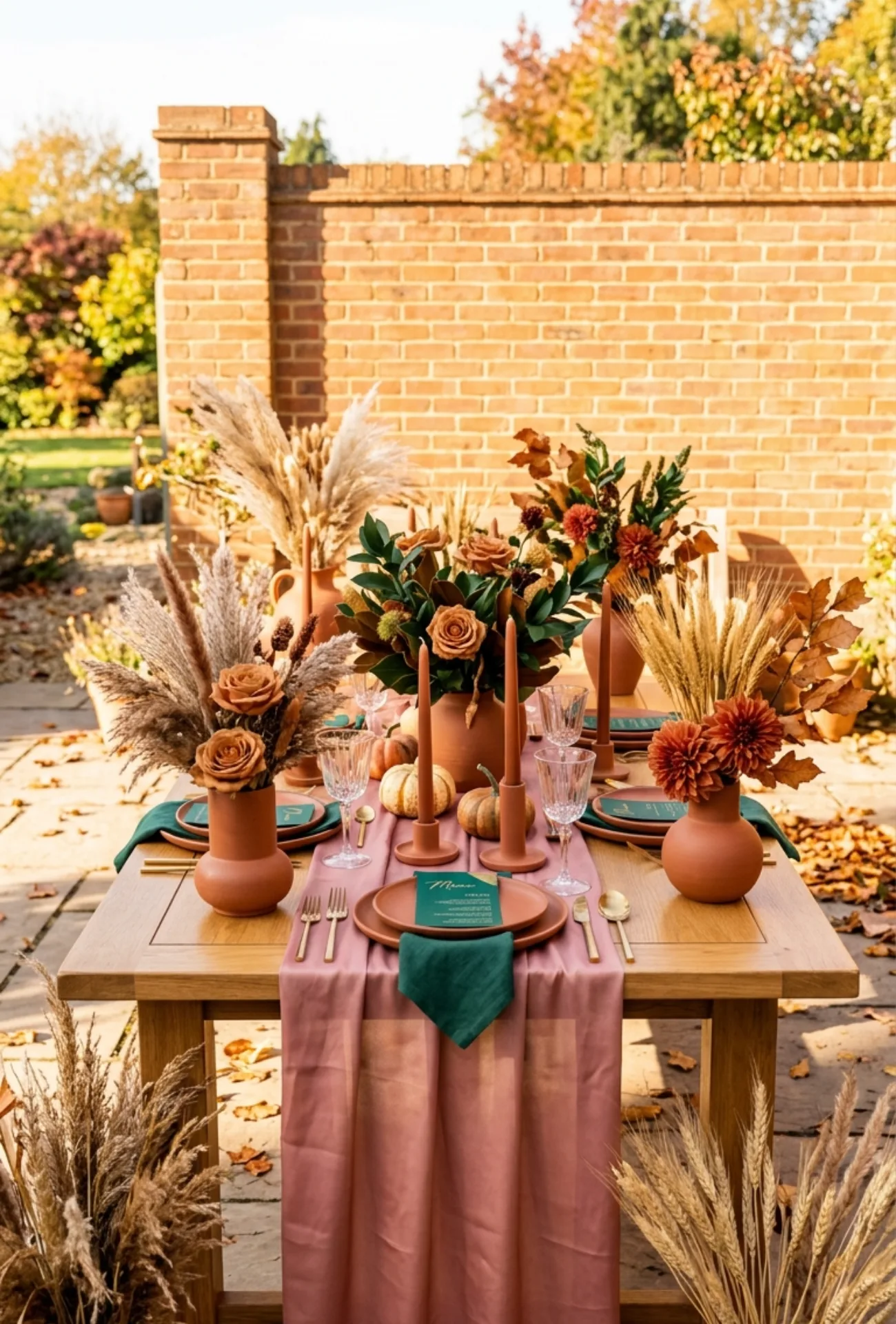
Emerald green in fall feels lush and unexpected in the best possible way. Cinnamon brown anchors it with warmth so it never feels out of place with the season.
Together they create a palette that feels like walking through a forest at peak fall color, rich, layered, and completely alive with texture and depth.
21. Clay Orange with Eucalyptus Green
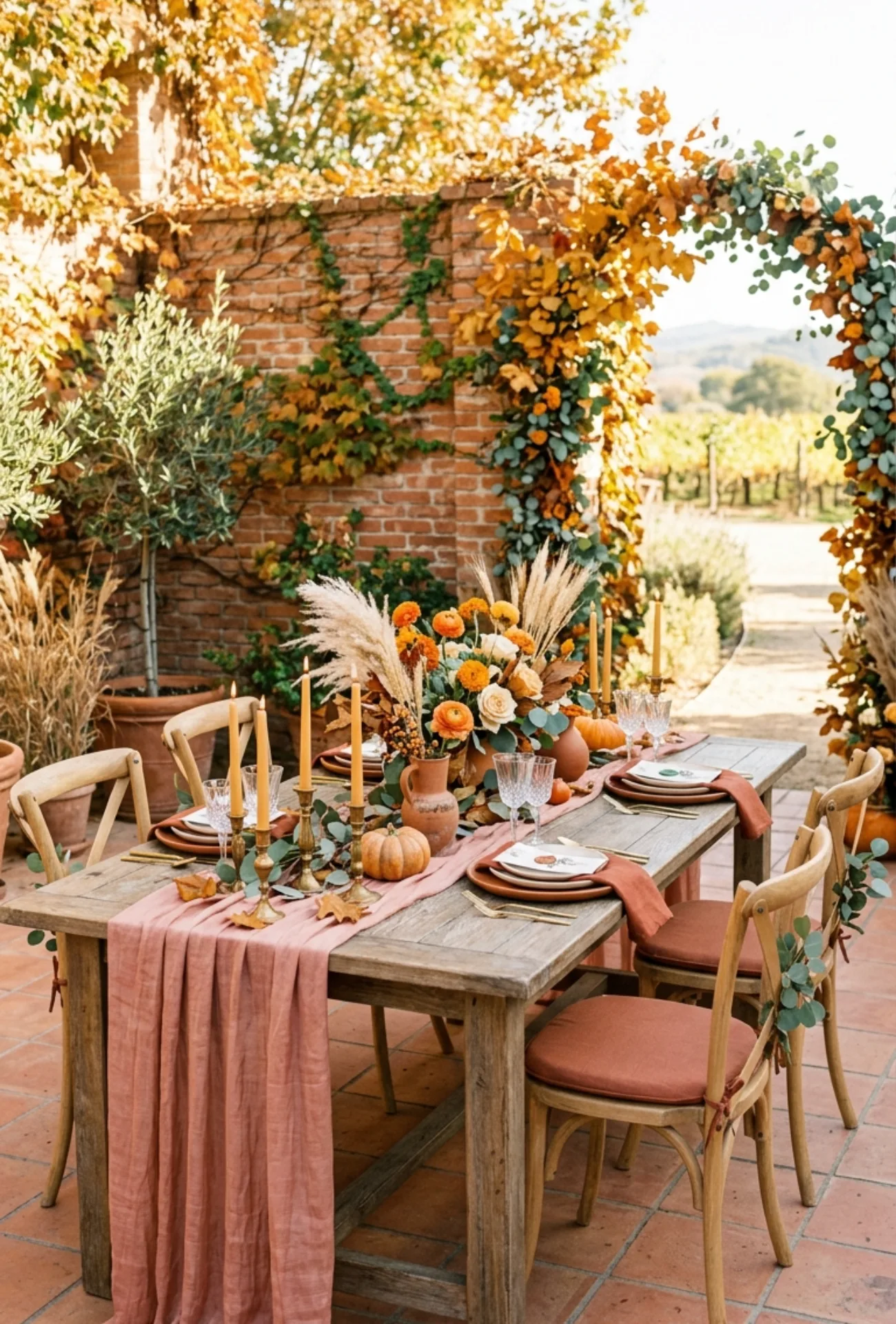
Clay orange is softer and more wearable than bright orange, making it a perfect fall tone for bridesmaids and floral arrangements alike. Eucalyptus green brings a fresh, airy quality that balances the warmth.
- Clay-toned bridesmaid dresses in satin or chiffon
- Eucalyptus garlands trailing across ceremony backdrops
- Clay orange ranunculus and marigolds in bouquets
- Green and terracotta wax seals on wedding stationery
This is a palette with real personality that still manages to feel relaxed and effortless.
22. Dusty Rose and Rich Cocoa
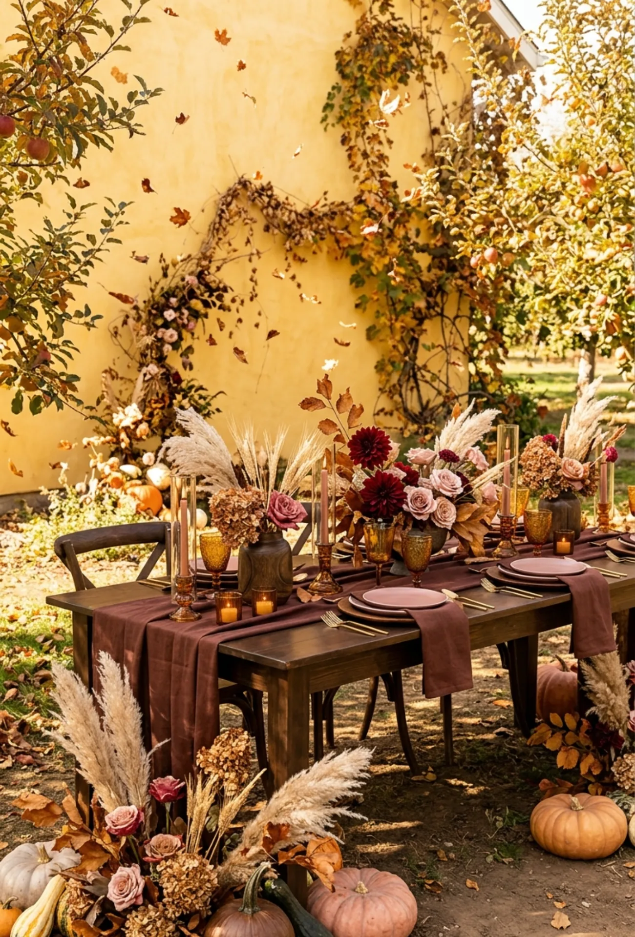
Dusty rose is soft and quietly romantic. Rich cocoa gives it a grounded, autumnal depth that makes this feel like a true fall palette rather than something borrowed from spring.
The warmth of cocoa in wooden accents, dark linens, and earthy details makes dusty rose florals look even more beautiful by contrast.
23. Maple Red with Warm Beige
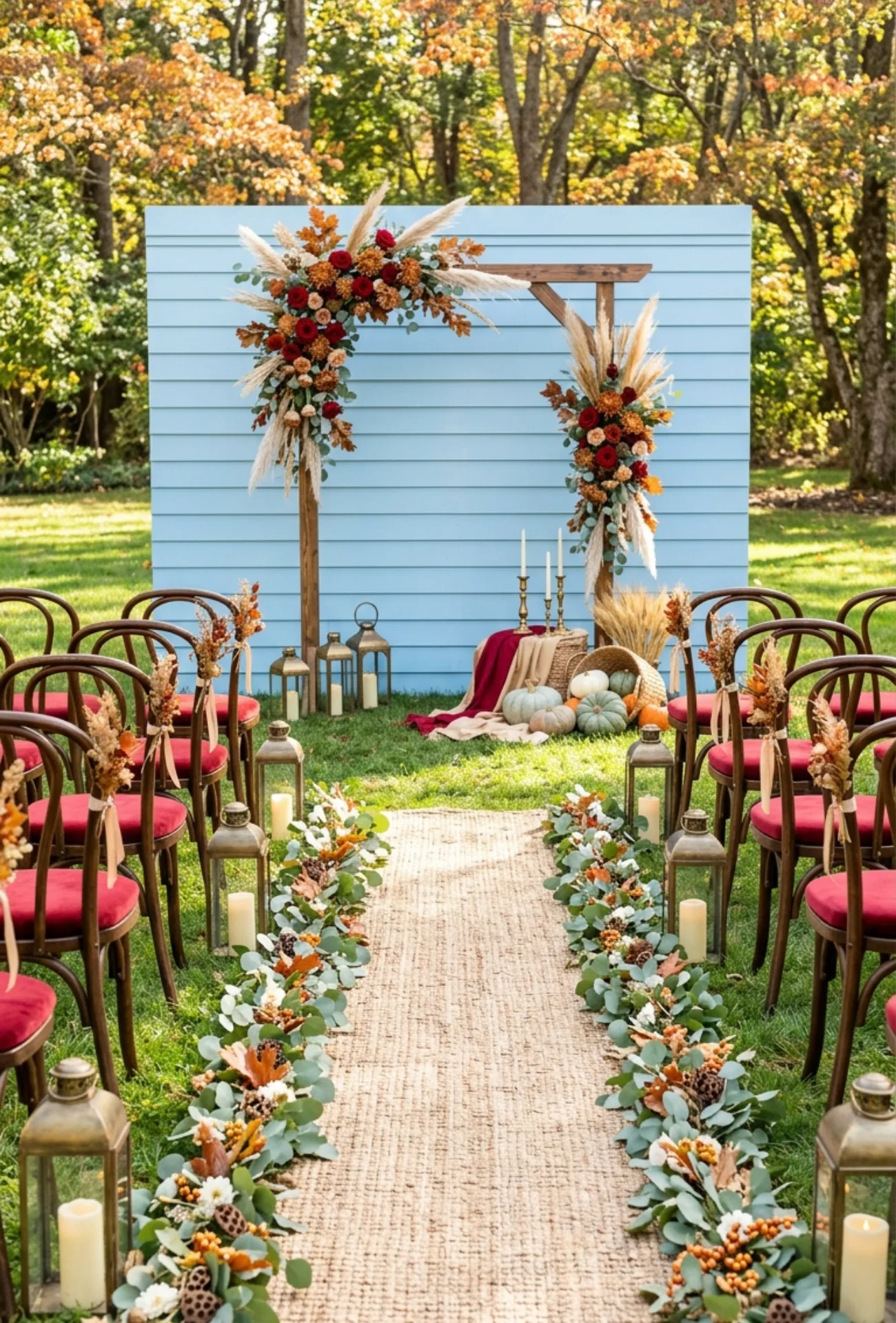
Maple red is that gorgeous in-between shade that captures the color of autumn leaves at their most vivid. Warm beige keeps it from feeling too intense so the whole palette stays breathable and soft.
This combination feels genuinely seasonal and works beautifully in both outdoor garden ceremonies and cozy indoor reception spaces with warm lighting.
24. Smoky Blue and Brushed Copper
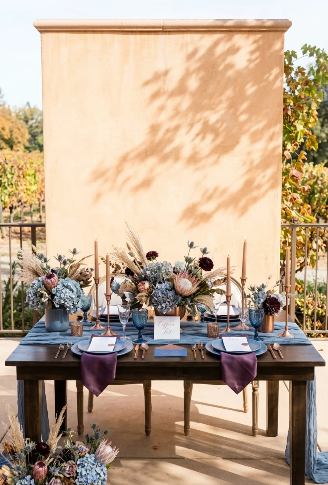
Smoky blue has an almost misty, atmospheric quality that feels made for fall. Brushed copper adds warmth and a subtle metallic glow that brings the whole palette to life.
| Detail | Smoky Blue | Brushed Copper |
| Florals | Dusty blue hydrangeas, thistles | Protea, dried grasses |
| Tableware | Blue glassware, chargers | Copper cutlery, candleholders |
| Stationery | Blue ink, envelope liners | Copper foil lettering |
Together they create a wedding aesthetic that feels moody, sophisticated, and quietly magical.
25. Truffle Brown with Elegant Ivory
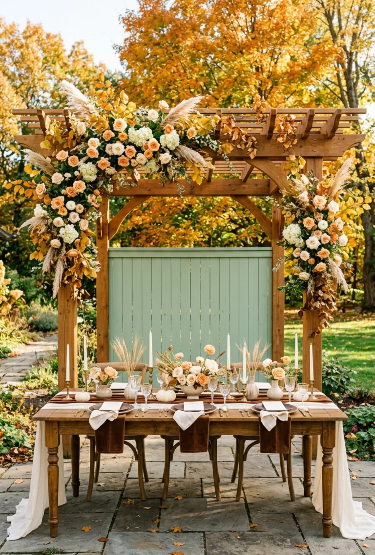
Truffle brown is rich, velvety, and deeply luxurious. Ivory brings the lightness that lets truffle breathe and keeps the overall look feeling refined rather than heavy.
This is the palette for couples who want their wedding to feel warm, elevated, and completely timeless, the kind of aesthetic that looks just as beautiful in photos thirty years from now as it does on the day itself.
Fall weddings are about embracing everything the season offers and letting it shape the way your celebration feels and looks.
Which of these 25 palettes speaks to your vision, and what one color do you absolutely cannot imagine your fall wedding without?