27 Neutral Home Decor Ideas That Never Go Out of Style
Neutral doesn’t mean boring. It means timeless, versatile, and effortlessly elegant. When you build your home around a neutral palette, you create a foundation that adapts to your changing tastes without requiring a complete overhaul.
The beauty of neutral decor is how it makes you feel. These spaces are calming, sophisticated, and always welcoming.
They let your personality shine through accessories and art while maintaining a cohesive, polished look that never feels dated.
Whether you love warm beiges, cool grays, or earthy taupes, neutral palettes work with every style and season.
They’re the secret behind those homes that always look put-together. Ready to discover how to make neutrals work beautifully in every room of your home?
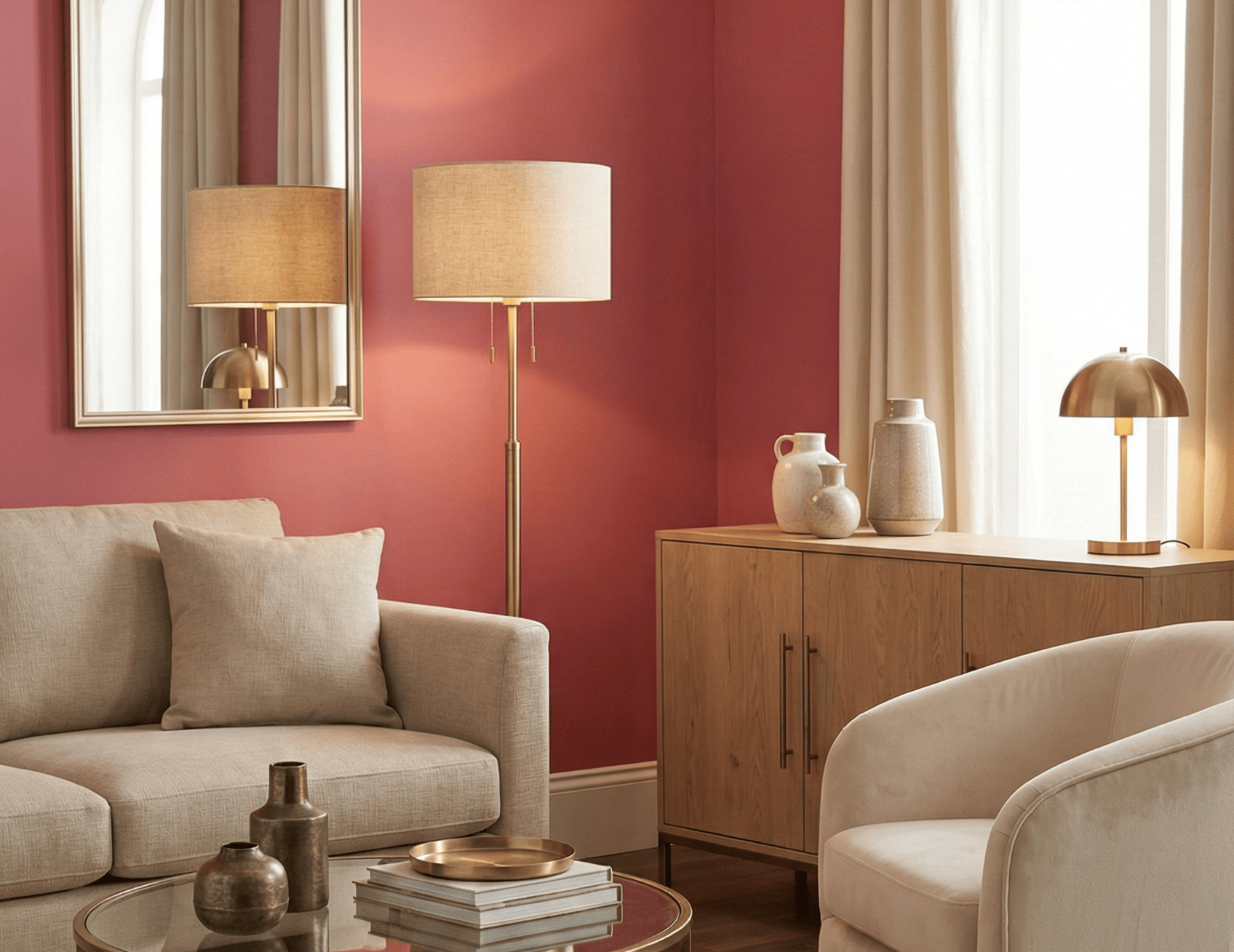
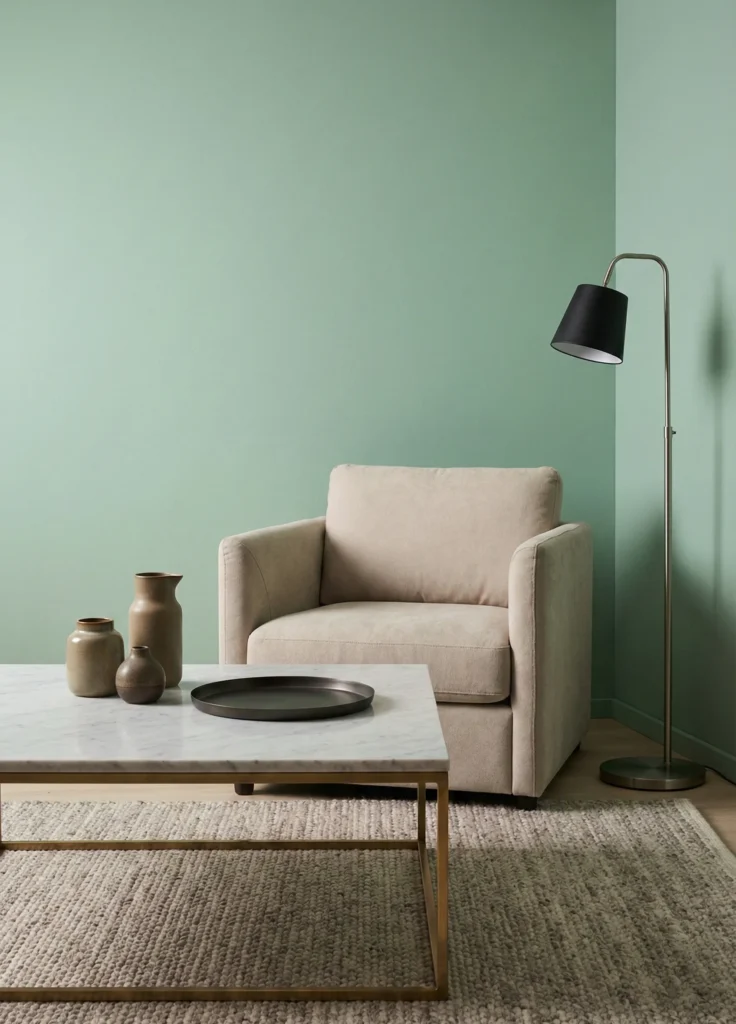
1. Warm Neutral Wall Colors

The right wall color sets the tone for everything else. Warm neutrals like greige, soft taupe, and creamy beige create a backdrop that feels both modern and cozy.
These colors adapt to your lighting throughout the day. Morning sun makes them glow softly, while evening light brings out their warmth and depth.
- Try colors like Agreeable Gray, Revere Pewter, or Ballet White
- Sample on multiple walls to see how light affects each shade
- Pair with white ceilings to maintain brightness
2. Layered Neutral Textiles
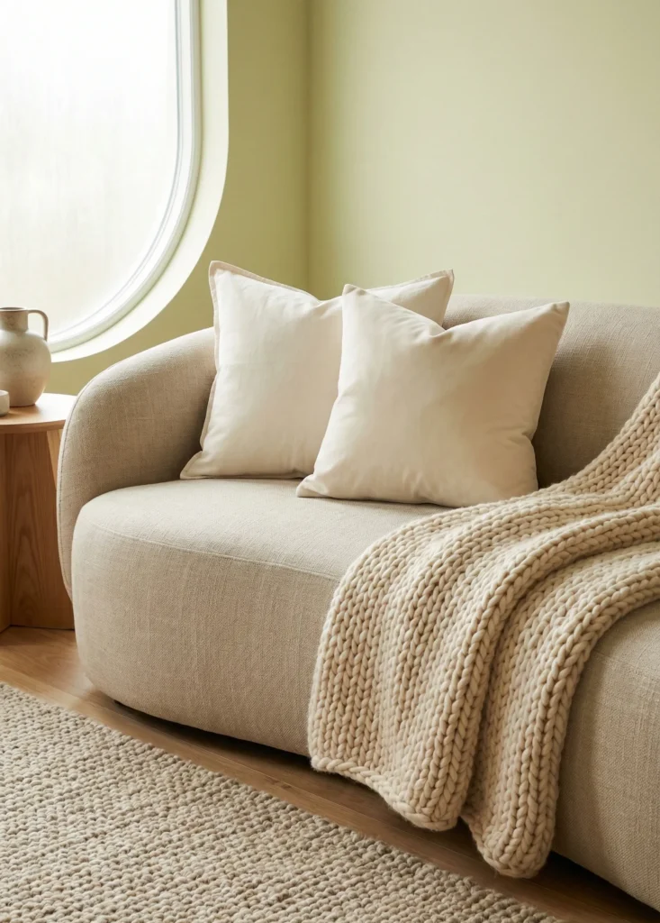
Texture is everything when working with neutrals. Layer linen, cotton, wool, and velvet in similar tones to create richness without adding color.
A linen sofa with cotton throw pillows, a chunky knit blanket, and a wool rug all in cream and beige tones feels luxurious and inviting. Each texture catches light differently, adding dimension to your space.
Mix smooth and nubby textures for contrast. The interplay between different fabrics keeps neutral rooms from feeling flat.
3. Mid-Tone Wood Furniture

Medium wood tones in oak, walnut, or teak bring warmth without overwhelming your neutral palette. These pieces have enough presence to anchor a room while staying versatile.
Unlike dark wood that can feel heavy or light wood that can read too casual, mid-tone wood hits the perfect balance. It works with both warm and cool neutrals.
Choose furniture with visible grain patterns. The natural variation in wood adds organic interest that complements your neutral foundation beautifully.
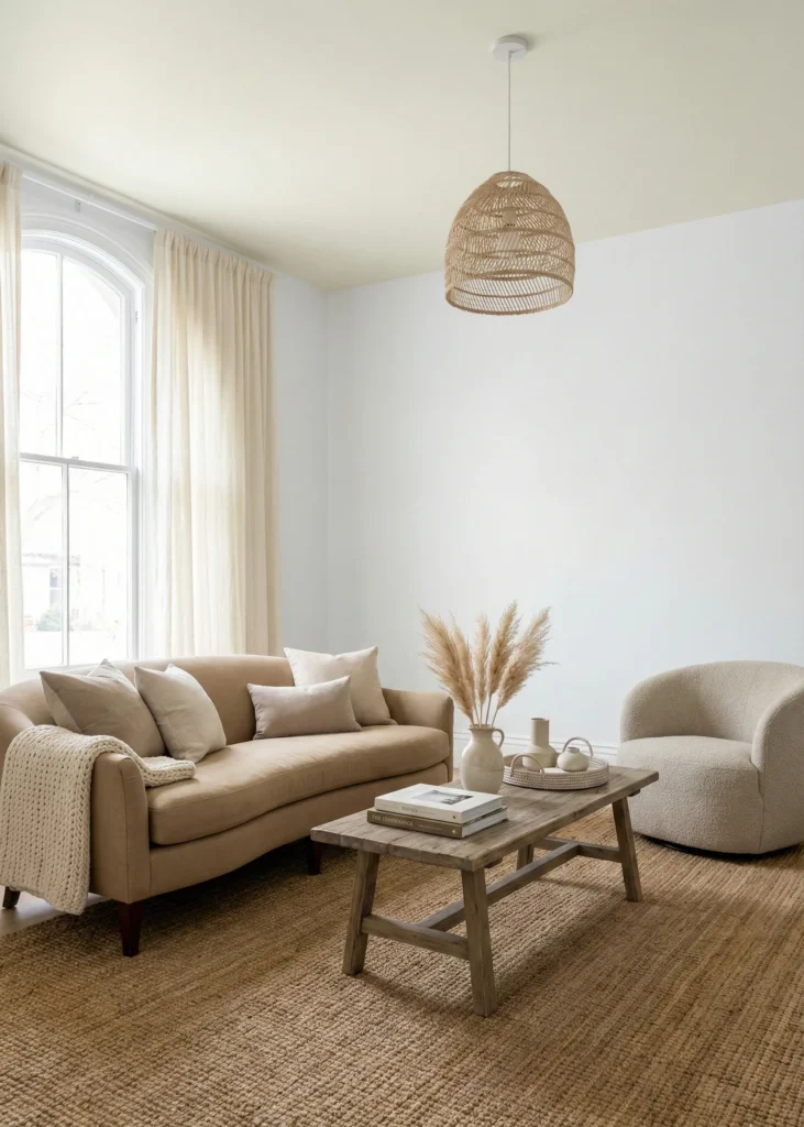
4. Curved Neutral Upholstery

Soft, rounded furniture in neutral fabrics creates an inviting atmosphere. A curved sofa in oatmeal linen or a barrel chair in warm taupe feels modern without being trendy.
The gentle shapes soften the straight lines of walls and windows. This balance between curved and linear elements keeps spaces feeling dynamic and comfortable.
- Look for sofas with rounded arms or curved backs
- Choose performance fabrics in neutral tones for durability
- Mix curved seating with straight-lined tables for contrast
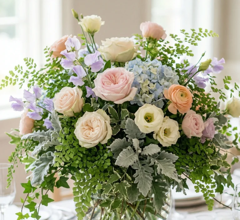
5. Textured Neutral Area Rugs
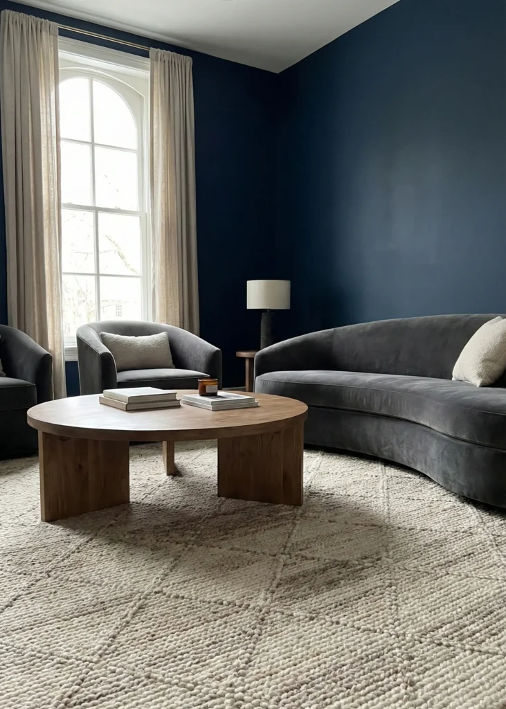
A beautiful rug grounds your space and defines your seating area. Choose rugs with texture and subtle pattern in neutral tones for maximum versatility.
Wool rugs with tonal geometric patterns, jute rugs with chunky weaves, or hand-knotted designs in creams and taupes add interest underfoot. They’re practical and beautiful at the same time.
| Rug Material | Texture | Best For | Maintenance |
| Wool | Soft, durable | Living rooms, bedrooms | Medium, professional clean yearly |
| Jute | Natural, textured | Casual spaces, layering | Low, vacuum regularly |
| Cotton | Flat, washable | High-traffic areas, kids’ rooms | Easy, machine washable |
6. Tonal Color Layering
Working within one color family creates sophisticated depth. Layer different shades of beige, from palest cream to rich camel, for a pulled-together look.
This approach feels intentional and curated. Your eye moves smoothly through the space because everything relates to everything else.
Keep your darkest neutral as flooring or furniture bases. Gradually lighten as you move up through fabrics, walls, and finally ceiling.
7. Matte Surface Finishes
Glossy finishes can feel too formal or sterile. Matte and satin finishes in neutral tones create warmth and sophistication without shine competing for attention.
Matte paint, honed marble, and brushed metals all contribute to a soft, cohesive look. These finishes feel expensive and considered.
The lack of reflection makes colors appear richer and more saturated. Your neutral palette feels more substantial and grounding.
8. Neutral Built-In Storage
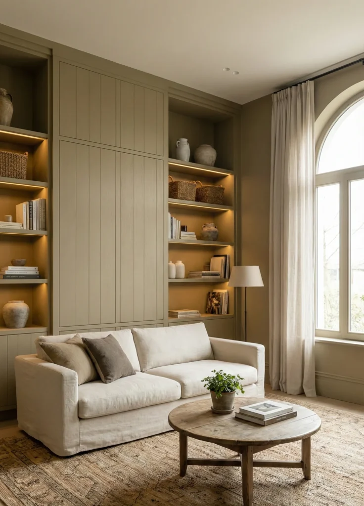
When storage matches your walls, it disappears. Built-in cabinets, shelving, and closets in the same neutral tone as your room create seamless flow.
This approach maximizes storage without adding visual clutter. Your belongings are hidden, but you haven’t sacrificed a single inch of function.
- Paint built-ins the same color as walls for continuity
- Use handleless designs for cleaner lines
- Add interior lighting to make them functional and beautiful
9. Subtle Neutral Pattern Mixing

Patterns don’t have to be bold to be impactful. Mix subtle patterns in the same neutral palette for layers of visual interest.
A striped pillow with a geometric throw and a textured solid all in shades of beige and cream creates depth. The patterns are there, but they whisper instead of shout.
Keep patterns in similar scale and stay within your neutral color range. This lets you have fun with design while maintaining that timeless, sophisticated feel.
10. Low-Profile Furniture

Furniture with lower profiles makes rooms feel more spacious and relaxed. A sofa with shorter legs or a low platform bed in neutral upholstery creates an airy, modern vibe.
The lower sightlines make ceilings appear higher. This optical trick works especially well in smaller spaces or rooms with standard ceiling heights.
Choose pieces that are low but still comfortable. You want style and function working together perfectly.
11. Soft Neutral Window Treatments

Long curtains in linen or cotton blends frame your windows beautifully. Choose neutral tones that complement your walls for a soft, layered look.
Floor-length panels in ivory, sand, or soft gray filter light without blocking it completely. They add privacy while maintaining that bright, airy feeling.
- Hang curtains high and wide to maximize window size
- Choose panels that puddle slightly on the floor for elegance
- Layer sheers behind heavier curtains for light control
12. Neutral Stone Accents

Natural stone in neutral tones brings organic beauty to your home. Travertine, limestone, or light marble adds texture and permanence.
A stone fireplace surround, kitchen backsplash, or bathroom vanity becomes a focal point without overwhelming your space. The natural variation in stone provides subtle pattern and interest.
Honed finishes work better than polished in most neutral schemes. They feel softer and more integrated with other natural materials.
13. Warm-Tone Lighting Layers

The right lighting makes or breaks a neutral space. Layer ambient, task, and accent lighting in warm tones to create depth and atmosphere.
Use bulbs in the 2700K-3000K range for that cozy, inviting glow. Multiple light sources at different heights add dimension and let you adjust mood throughout the day.
| Lighting Type | Purpose | Placement Ideas |
| Ambient | Overall illumination | Ceiling fixtures, chandeliers |
| Task | Functional light for activities | Table lamps, reading lights |
| Accent | Highlight features | Picture lights, uplighting |
14. Textured Neutral Wall Finishes
Beyond paint, consider textured finishes that add depth to neutral walls. Lime wash, Venetian plaster, or grasscloth wallpaper creates subtle dimension.
These finishes catch light differently throughout the day. The texture creates shadow and depth that flat paint can’t achieve.
Choose finishes in shades that complement your overall palette. The texture adds interest while maintaining your neutral foundation.
15. Minimalist Neutral Artwork

Art in neutral tones continues your color story while adding personality. Abstract pieces in creams, taupes, and soft grays or black and white photography work beautifully.
Large-scale pieces make a statement without introducing competing colors. They feel cohesive with your space rather than demanding attention.
Frame art in simple wood or metal frames that blend with your palette. The focus stays on the artwork itself, not the frame.
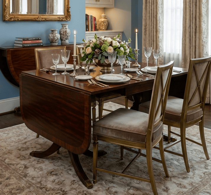
16. Neutral Upholstered Dining Seating

Dining chairs in neutral fabric bring softness to your dining area. Linen or performance velvet in beige, gray, or cream feels sophisticated and comfortable.
Upholstered seating makes dinner last longer because everyone’s comfortable. It transforms your dining room from formal to inviting.
- Choose performance fabrics for easy cleaning
- Mix upholstered chairs with a wood table for contrast
- Consider slipcovered options for versatility
17. Soft Metallic Accents

Metals in warm finishes add subtle shine to neutral spaces. Brushed brass, aged bronze, or champagne gold bring elegance without overwhelming.
These metals feel warmer and more integrated than bright silver or chrome. They enhance your neutral palette rather than competing with it.
Use metallics sparingly in lighting fixtures, cabinet hardware, and decorative objects. A little goes a long way in creating that collected, layered look.
18. Layered Neutral Bedding

Your bed should be a neutral haven. Layer different shades and textures of neutral bedding for a luxurious, hotel-inspired look.
Start with crisp white sheets, add a textured duvet in cream or beige, then layer with euro shams in linen and a chunky knit throw. Each layer adds comfort and visual interest.
Mix materials like cotton, linen, and velvet in your bedding. The variety in texture keeps an all-neutral bed from feeling boring.
19. Balanced Neutral Open Shelving

Open shelving styled in neutral tones keeps things interesting without creating chaos. Display cream ceramics, natural wood bowls, and linen-bound books.
The key is varying heights and shapes while staying within your color palette. Leave generous space between objects so each piece can breathe.
- Group items in odd numbers
- Mix matte and glossy finishes
- Include natural elements like dried branches or stones
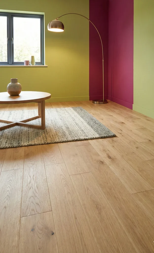
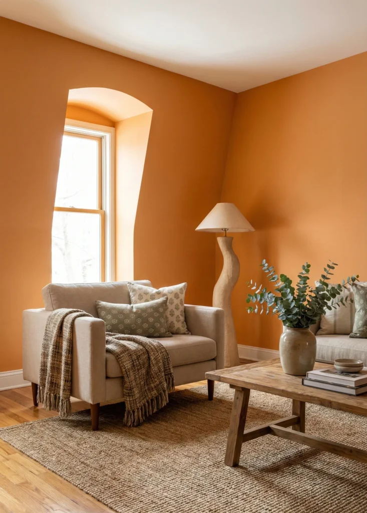
20. Earth-Toned Neutral Accents
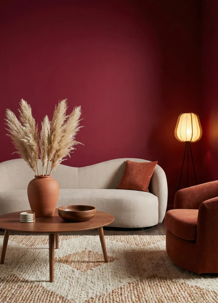
Terracotta, rust, and warm browns add depth to neutral spaces. These earth tones feel natural and grounding alongside creams and beiges.
A terracotta vase, rust-colored throw pillow, or wood bowl in rich walnut brings warmth without breaking your neutral scheme. These colors are still neutral, just deeper.
These accent tones work especially well in fall and winter. They make your space feel cozy when natural light is limited.
21. Neutral Flooring with Natural Grain
Beautiful flooring sets the foundation for everything else. Light to medium wood floors with visible grain add warmth and character.
Wide planks in oak, maple, or hickory create a sense of spaciousness. The natural variation in wood grain provides pattern without being busy.
| Flooring Type | Tone | Best For | Durability |
| White Oak | Warm neutral | Modern, transitional | Excellent |
| European Oak | Cool to warm neutral | Contemporary, Scandinavian | Excellent |
| Maple | Light, cool neutral | Bright, airy spaces | Very good |
22. Comfort-Driven Neutral Seating

Invest in seating that’s as comfortable as it is beautiful. Deep sofas and oversized chairs in neutral fabrics invite you to relax and stay.
Performance fabrics in neutral tones mean you don’t have to sacrifice comfort for style. Your seating can handle real life while looking sophisticated.
Add plenty of pillows in varying sizes and textures. Neutral pillows in linen, velvet, and cotton create that layered, inviting look.
23. Consistent Neutral Palette Flow
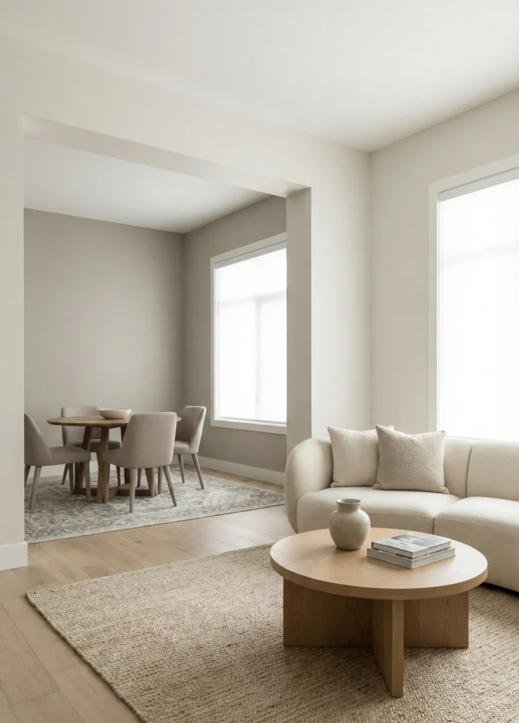
When the same neutral tones flow from room to room, your home feels larger and more cohesive. You create a sense of continuity that’s both calming and sophisticated.
This doesn’t mean everything has to match exactly. Vary the balance of warm and cool neutrals, but keep them in the same family.
Your eye travels smoothly through spaces without jarring color changes. This creates a gallery-like quality that feels intentional and refined.
24. Neutral Entryway Foundations
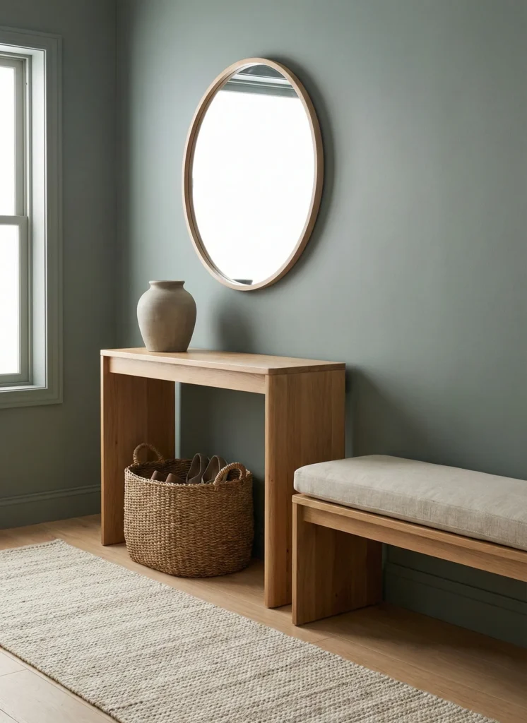
First impressions matter. A neutral entryway with warm wood, soft textiles, and beautiful storage sets the tone for your entire home.
A console table in natural wood, a woven basket for shoes, and a mirror with a simple frame create function and beauty. Everything works together seamlessly.
- Add a runner in a neutral tone for warmth
- Include a place to sit for putting on shoes
- Display one beautiful object rather than cluttering surfaces
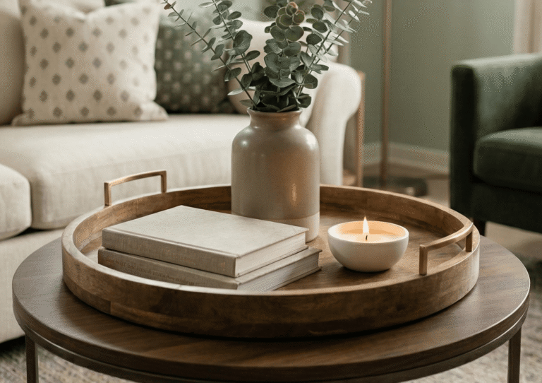
25. Understated Neutral Decorative Objects

Decorative objects in neutral materials become art. A sculptural ceramic vase, smooth stone bookends, or wooden bowl adds beauty without color.
These objects feel collected and intentional. Their neutral tones let you appreciate their form and texture rather than being distracted by color.
Choose quality over quantity. A few beautiful neutral objects make more impact than many colorful ones competing for attention.
26. Textured Neutral Kitchens

Kitchens in neutral tones feel timeless and sophisticated. Mix materials like marble, wood, and matte tile in complementary neutral shades.
White or cream cabinets with warm wood flooring and stone countertops create layers of neutral texture. Each material brings its own character while working together beautifully.
Consider a slightly deeper neutral for your island. This creates a focal point while staying within your palette.
27. Flexible Neutral Base Styling
The greatest advantage of neutral decor is flexibility. Your neutral base adapts to seasonal changes, new trends, or evolving personal style.
Swap pillows and throws for different seasons. Add greenery or fresh flowers in any color. Your neutral foundation supports everything without fighting for attention.
This approach saves money long-term because you’re not constantly repainting or replacing furniture. You’re simply refreshing accents as your mood or the season changes.